
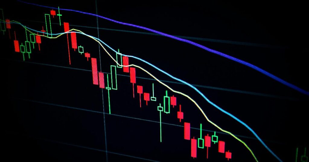
What a $10,000 Investment’s Worst Year Reveals About Time in the Market
Imagine two investors, each putting $10,000 into the S&P 500. One starts in 1982, at the dawn of an 18-year bull run. The other starts in 2000, at the peak of the dot-com bubble. Judged after twelve months, their results look like they belong to different asset classes — one investor is comfortably ahead, the other has watched a chunk of their money evaporate. Judged after thirty years, the gap narrows into something far less dramatic: both investors end up richer, even if by very different amounts. That contrast is the real subject of this article, and it points to a distinction many investors blur — the difference between short-term volatility and long-term investment risk.