Market History

Educational reviews of historical market scenarios, crises, bubbles, recoveries, and long periods of weak returns. History is used as a source of context, not as a reliable forecast of the future.

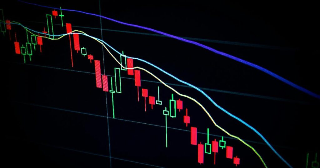
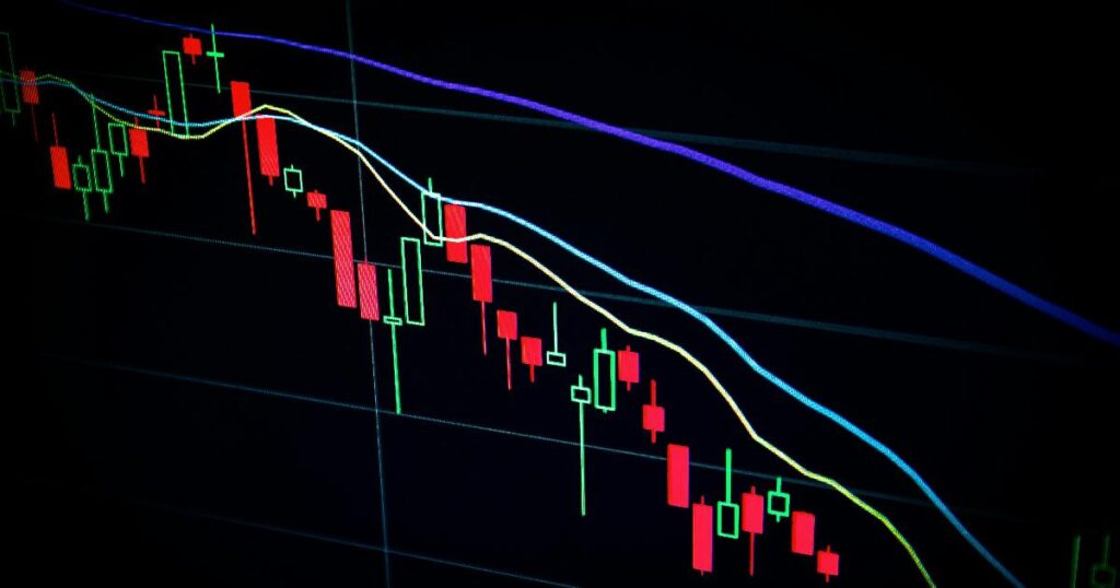
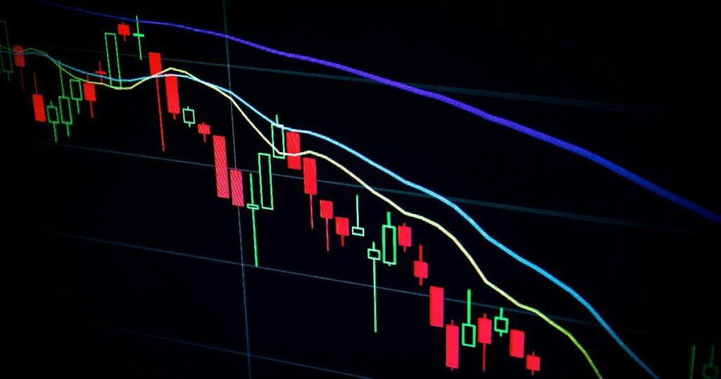
A chart showing a trend-following strategy and momentum investing over time across market cycles
Market History

Trend-Following and Momentum Have a Century of Data Behind Them — So Why Doesn’t That Settle the Debate?

A reader of the finance blog A Wealth of Common Sense recently asked a fair question: is there real evidence that trend-following or momentum works for someone like them, not just for hedge funds with access to futures markets? It’s a good question because it separates two things that often get blurred together — whether a pattern in historical prices is real, and whether that pattern is something an ordinary investor should build into a portfolio. Those are not the same question, and the answer to the first does not automatically answer the second.

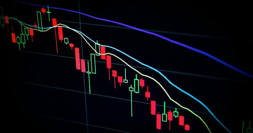
A financial analyst reviewing stock charts and market forecasts, illustrating the limits of the market forecasting lesson from 2016
Market History

The Golden Era That Wasn’t: What a 2016 Warning Teaches Us About Forecasting Markets

In 2016, a widely cited report warned that anyone turning 30 that year faced a bleak financial future: work seven years longer, or save nearly twice as much, just to retire the way their parents had. The message spread quickly because it felt plausible — inflation and interest rates had fallen for decades, corporate profits were unusually high, and stock valuations had already expanded. Surely the easy gains were behind us. A decade later, the market has delivered a real-world answer, and it is almost the opposite of what the warning implied. That gap is not proof the warning was foolish. It is a case study in something more useful: what happens when a reasonable scenario gets treated like a prediction.

Historical stock market chart showing the divergence between S&P 500 index recovery and individual Nifty Fifty stocks during the 1970s bear market, illustrating concentration risk in a portfolio.
Market History

The Nifty Fifty Paradox: How a Market Can Recover While Your Portfolio Never Does

In December 1972, a Wall Street money manager could tell you with total confidence which fifty stocks belonged in every serious portfolio. Xerox. IBM. Polaroid. Coca-Cola. Avon. These were the “one-decision” stocks — you bought them, and you never had to think again. Some traded at 50, 80, even 90 times earnings, multiples that would make even today’s most enthusiastic tech investor pause. Within two years, several of them had lost more than three-quarters of their value. A decade later, the broad market had long since moved on, but many of the era’s favorite names were still nursing wounds — some of them permanent. And yet, if you zoom out far enough, an equally weighted basket of those same fifty stocks eventually matched the market’s return over the following quarter century. Both of those facts are true at once, and understanding why is the whole point of this article.

A historical stock market chart showing modest daily gains, illustrating the 54% edge in market history
Market History

The 54% Illusion: Why a Tiny Daily Edge Doesn’t Guarantee an Easy Ride

A market that finishes higher on barely more than half its trading days sounds like a coin flip with a slight thumb on the scale — hardly the stuff of retirement security. And yet that modest edge, held long enough, has turned patient savers into comfortable retirees while impatient ones locked in losses trying to dodge the very days that made the difference. The catch is that the statistic everyone quotes — “the market is up 54% of the time” — is more of a doorway than an explanation. Walk through it carelessly and you’ll misread what it actually promises.

A chart of market volatility showing how the best days and worst days cluster together during market crashes, illustrating the market timing lesson
Market History

Bob Bought at Every Market Peak for 40 Years. He Still Retired a Millionaire.

Two of the most quoted stories in personal finance seem to point in opposite directions. One says a chronically unlucky investor named Bob can buy at the worst possible moments for four decades and still end up rich. The other says missing just ten good trading days out of thousands can gut your lifetime returns. Readers who encounter both eventually ask the obvious question: if timing really matters that much, how did Bob survive it?

A century of U.S. stock returns shown as a chart, highlighting how the average hides wide volatility and uneven compounding
Market History

A Century of U.S. Stock Returns: Why the Average Hides More Than It Reveals

Imagine buying U.S. stocks at some random moment over the past hundred years and then asking a simple question: what actually happened next? Not on average, not in theory — what happened to your money over the following month, year, decade, or two? The honest answer is unsettling for anyone who likes tidy numbers: it depends enormously on which “next” you’re asking about, and the single average return figure that gets quoted in almost every retirement calculator obscures that fact almost completely.

Scroll to Top